- Color Psychology & Trends
- Paint Color Inspiration
- Room & Space Design
Trending Kitchen Colors in 2026
Kitchen color trends in 2026 have shifted away from stark, high-contrast spaces toward warmer and softer palettes. The stark all-white kitchen isn’t gone, but it’s evolving into something more layered and livable. The drive is toward kitchens that feel inviting, balanced, and personal rather than overly polished.
One of the most notable trends is the move toward earth-inspired colors. Greens, browns, and clay tones are surging in popularity, because of the ways they can bring a grounded, calming feel to a kitchen. Shades like October Mist and Evergreen Fog exemplify this trend.
At the same time, many interior designers and homeowners are using deeper and moodier tones to add character. Rich blues and warm browns like Hale Navy and Urbane Bronze are being used to create depth without feeling harsh.
Another key trend this year is warm minimalism—defined by moving away from cool grays toward layered neutrals to create a soft aesthetic that still keeps a clean and timeless look.
Read on to explore popular kitchen colors and get tips for choosing the right hues for yours.
Trending Kitchen Colors for 2026
While these shades reflect the strongest current trends, they can still help create a timeless look.
Earthy Greens
Soft, muted greens continue to lead the way in kitchen design. They work especially well on cabinetry, pairing beautifully with wood accents and brass hardware.
- october-mist-1495-12x12
- saybrook-sage-hc-114-12x12
- clary-sage-6178-12x12
- evergreen-fog-9130-12x12
Deep Blues and Teals
Moody blues offer a sophisticated alternative to black or gray. These shades are ideal for creating contrast on islands or lower cabinets.
- hale-navy-hc-154-12x12
- van-deusen-blue-hc-156-12x12
- naval-6244-12x12
- smoky-blue-7604-12x12
Warm Neutrals
Shades like this are replacing cooler grays as the go-to foundation for kitchen color palettes. They provide flexibility, working well with almost any kind of countertop or backsplash.
- pale-oak-oc-20-12x12
- muslin-1037-12x12
- accessible-beige-7036-12x12
- natural-linen-9109-12x12
Rich Reds and Earthy Terracottas
Warmer, reddish tones are gaining popularity as statement colors. They’re best used on an island, pantry, or accent wall.
- dinner-party-af-300-12x12
- baked-clay-6340-12x12
- cavern-clay-7701-12x12
- redend-point-9081-12x12
Mocha and Deep Browns
Refined and modern browns are making a strong comeback. These tones add richness and warmth, working especially well in larger kitchens.
- kendall-charcoal-hc-166-12x12
- urbane-bronze-7048-12x12
- turkish-coffee-6076-12x12
Soft and Warm Whites
The traditional white kitchen look is giving way to shades with softer undertones. These feel more relaxed and less stark.
- white-dove-oc-17-12x12
- swiss-coffee-oc-45-12x12
- alabaster-7008-12x12
- greek-villa-7551-12x12
How Lighting Affects Kitchen Color Choices
Lighting plays a major role in how paint colors appear in your kitchen. Keep these factors in mind when considering color possibilities.
Natural Light Direction
North-facing kitchens tend to have cooler, bluish light. Warmer colors like Accessible Beige and Swiss Coffee help provide balance.
South-facing kitchens receive warmer sunlight, allowing you to use cooler tones like Hale Navy or Smoky Blue without making the space feel cold.
Artificial Lighting
LED and fluorescent lighting can shift how undertones appear. A greige like Pale Oak may look warmer in daylight but slightly cooler at night. This is one reason it’s crucial to test paint samples under your actual lighting. (More on sampling below.)
Finish
Matte and satin finishes absorb light, giving colors a softer, more modern appearance. Glossier finishes reflect light, which can make colors appear brighter or more intense.
Layered Lighting and Color Depth
Combining ambient, task, and accent lighting helps bring out the full dimension of your colors. This is especially true with deeper shades like Urbane Bronze and Van Deusen Blue.
Tips for Choosing Kitchen Colors
Even within trending colors, you still have a lot of options. The steps below can help you narrow down your search.
1. Define the Mood You Want
Color has a strong emotional impact. Whether you want your kitchen to feel calm, refined, cozy, or energizing, your paint color can help you achieve that vibe.
2. Work With Your Existing Materials
Your countertops, flooring, backsplash, and cabinetry all influence how a paint color will look. Look for inspiration in these elements.
3. Think About Space and Scale
Smaller kitchens often benefit from lighter shades, which help the space feel more open. In a larger kitchen, deeper tones can add personality and a touch of intimacy without making the room feel cramped.
4. Use Contrast Strategically
To give the room dimension and visual interest, consider a layered approach, such as light upper cabinets with darker lowers or a bold island color paired with neutral walls.
5. Balance Trend and Longevity
While it can be tempting to go bold, it’s important to choose a color you’ll enjoy for a long time to come. Going with a timeless base and a trending accent color is a good way to achieve that balance.
6. Test Before You Commit
There’s no substitute for seeing a color in your actual space. Samplize makes that important step easy. Read on to see how it works.
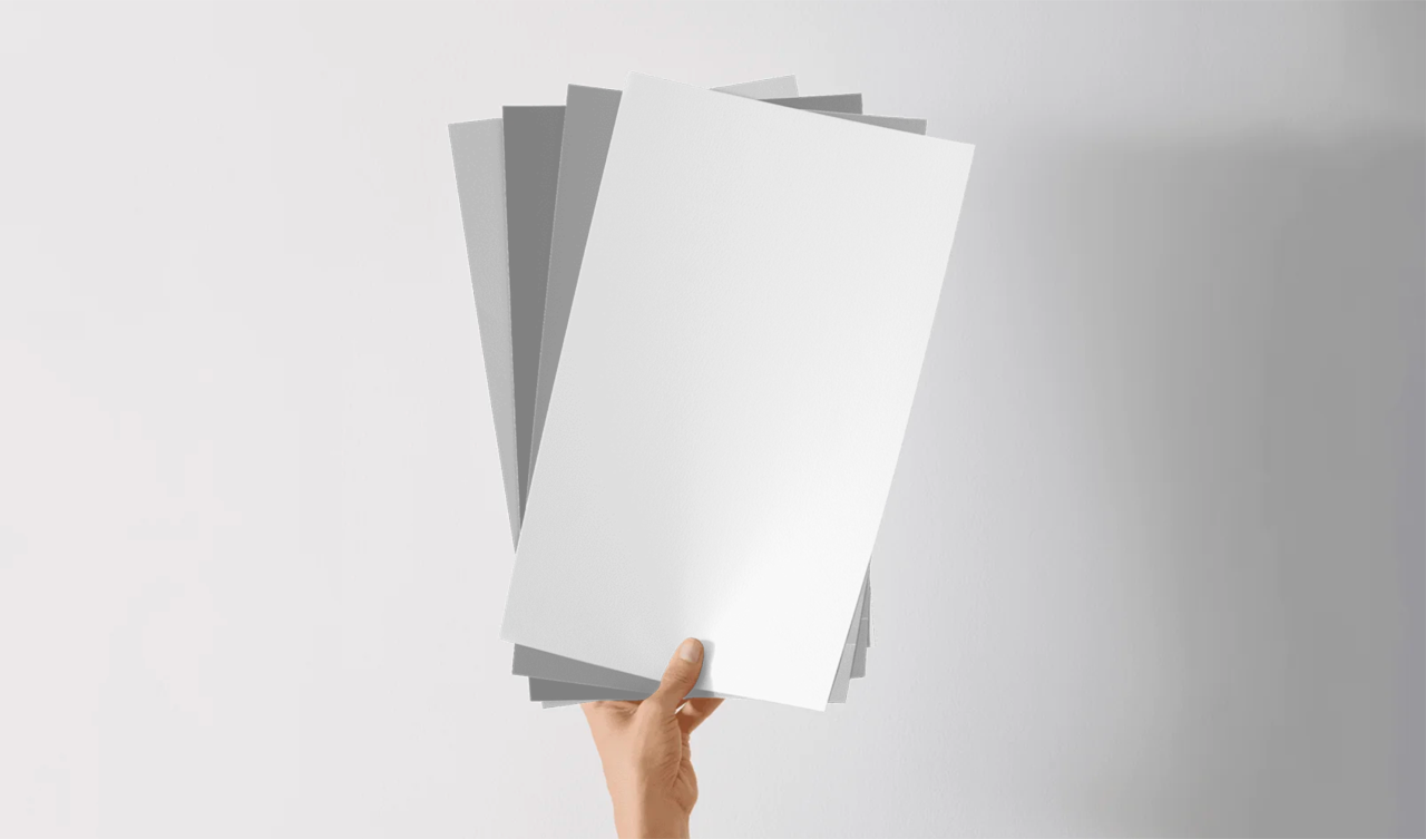
Sampling Kitchen Colors With Samplize
Samplize uses real paint to make large-format, mess-free peel-and-stick samples. This allows you to sample colors without painting surfaces.
You can start with Samplize color bundles, where you’ll find a wide range of options organized by color families and themes. You can browse collections curated by color experts and trusted brands, find tips and inspiration in the Samplize blog, or explore 1000s of colors on your own.
When a color strikes you, just add it to your cart. When you have a good stack of options, complete your order, and your samples will arrive at your door the next day.
Test one sample first on an inconspicuous spot and then feel free to apply all your samples side by side. Notice how each color looks at different times of day and in different lighting conditions. Notice how well each harmonizes with the undertones of other elements in the space.
If you still aren’t in love with one color, just repeat the steps above until you can choose with confidence.
Ready to Begin?
Painting your kitchen is a big decision that will impact the aesthetic of your entire home. Start your search for just the right color here.